You are using an out of date browser. It may not display this or other websites correctly.
You should upgrade or use an alternative browser.
You should upgrade or use an alternative browser.
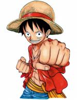
[Gimp] Minato Namikaze!
- Thread starter Akаsh
- Start date
More options
Who Replied?


- Joined
- Oct 24, 2009
- Messages
- 25,039
- Reaction score
- 881
It's nice but with the red brush you used, there is too many pixels. It should flow more.
actually i did that knowingly
i thought it looked nice
- Joined
- Nov 21, 2011
- Messages
- 2,298
- Reaction score
- 117
Pretty good
- Joined
- Feb 14, 2012
- Messages
- 1,252
- Reaction score
- 107
Lol I thought it said "YONGAIME" Hahaha
- Joined
- Nov 15, 2011
- Messages
- 1,174
- Reaction score
- 28
not bad i would give it a 7 out of 10


- Joined
- Mar 20, 2012
- Messages
- 3,843
- Reaction score
- 228
cool
- Joined
- Nov 13, 2011
- Messages
- 1,901
- Reaction score
- 257
it's Good background needs more work though too much Orange/Red


- Joined
- Apr 30, 2010
- Messages
- 973
- Reaction score
- 281
Wayy to much noise in the background, too many speckles espesh on the right side. My opinion would be keep the yellow flow around him and make the orange around him sorta his skin colour maybe as the orange draws too much attention away from the render but overall good effort =]
- Joined
- Mar 26, 2011
- Messages
- 54,369
- Reaction score
- 4,156
please comment and reps
Do not ask for rep. People will give it to you for they like it.
OT: It looks okay.