You are using an out of date browser. It may not display this or other websites correctly.
You should upgrade or use an alternative browser.
You should upgrade or use an alternative browser.
[Photoshop] Something New
- Thread starter Teach
- Start date
More options
Who Replied?
- Joined
- Aug 6, 2011
- Messages
- 4,749
- Reaction score
- 210
Nice
- Joined
- May 19, 2011
- Messages
- 13,990
- Reaction score
- 646
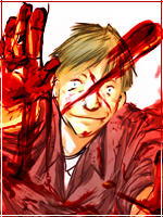
Lighting is good, blending not bad. I like the glittery brushes and those lines, you should have put them over the render layer, making it blend a little more you know, because it seems like all the brush effects are behind the render.
Would rate it 8/10")
Would rate it 8/10

Teach
Member
- Joined
- Dec 7, 2011
- Messages
- 127
- Reaction score
- 18
Lighting is good, blending not bad. I like the glittery brushes and those lines, you should have put them over the render layer, making it blend a little more you know, because it seems like all the brush effects are behind the render.
Would rate it 8/10
Thanks, I managed to get some successful lightning in it for once, and yeah I thought of that but I wasn't too sure about it though. I'll try and fix that up later. xd
- Joined
- Feb 27, 2011
- Messages
- 10,266
- Reaction score
- 544
the lightning doesn't really look like lightning , but i'm not sure , maybe
and as sai before the glittery brush should be also in front of the render
other than that it's really good and nice to look at
and as sai before the glittery brush should be also in front of the render
other than that it's really good and nice to look at
- Joined
- Mar 13, 2009
- Messages
- 8,447
- Reaction score
- 650
You didn't blend it right. Some of those white light lines should go in front of him. Also, you should have put some light to him and perhaps some adj layers to blend the colors, so it looks like he's actually there. xD If the blending and the light were right, would be a great sig as the flow is well done.

- Joined
- Nov 1, 2011
- Messages
- 2,858
- Reaction score
- 77
I like it! You should add a text

- Joined
- Jul 4, 2011
- Messages
- 6,143
- Reaction score
- 2,009
You didn't blend it right. Some of those white light lines should go in front of him. Also, you should have put some light to him and perhaps some adj layers to blend the colors, so it looks like he's actually there. xD If the blending and the light were right, would be a great sig as the flow is well done.
I totally agree with her, there isn't anything else that needs to be said.

