Stay Fresh...

Dino

Active member
Regular
Joined
Apr 2, 2011
Messages
1,818
Kin
118💸
Kumi
480💴
Trait Points
0⚔️
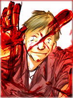
Umm, I started messing around with PS once again. I'd like to know what you think of this tag. Critiques are appreciated! <3

With Text
You must be registered for see images


Without Text
You must be registered for see images


Another Text version
You must be registered for see images


Last edited:

Yono

Member
Joined
Dec 17, 2010
Messages
153
Kin
0💸
Kumi
0💴
Trait Points
0⚔️
It seems like you have this basic smudge picture with some foreground effects thrown on the focal rather than around it...Shouldn't it be the other way around? I mean, the effects add depth when they go on the render, but it looks like it's getting too close to the focal point. Otherwise, not bad. I really like the smudging with this tag.
 

Dino

Active member
Regular
Joined
Apr 2, 2011
Messages
1,818
Kin
118💸
Kumi
480💴
Trait Points
0⚔️
It seems like you have this basic smudge picture with some foreground effects thrown on the focal rather than around it...Shouldn't it be the other way around? I mean, the effects add depth when they go on the render, but it looks like it's getting too close to the focal point. Otherwise, not bad. I really like the smudging with this tag.
I wanted the left side (for us) to go over the shoulder. It was intentional. This was just me experimenting some new things so I just threw whatever popped up into the image. I was fairly pleased with the result, though there is alot of room for improvement. I haven't really done smudge sigs before, just a couple...and that was around 2 months ago.

you must teach me as my photoshop sensei U_U
There are loads of others out there who can help you out. :p I'm just an amateur. o_o If you insist, I'll try to help you out though. :3

I like without text better :D
I almost never get the text right! Damn!!
 
Last edited:

Uchiha Paulsama

Active member
Elite
Joined
Aug 30, 2011
Messages
6,024
Kin
0💸
Kumi
0💴
Trait Points
0⚔️
I wanted the left side (for us) to go over the shoulder. It was intentional. This was just me experimenting some new things so I just threw whatever popped up into the image. I was fairly pleased with the result, though there is alot of room for improvement. I haven't really done smudge sigs before, just a couple...and that was around 2 months ago.


There are loads of others out there who can help you out. :p I'm just an amateur. o_o


I almost never get the text right! Damn!!
LOL teach me as a sempai :p , one day not now because im about to get off lol, well i just have questions that im sure you can ask.
It seems like you have this basic smudge picture with some foreground effects thrown on the focal rather than around it...Shouldn't it be the other way around? I mean, the effects add depth when they go on the render, but it looks like it's getting too close to the focal point. Otherwise not bad. I really like the smudging with this tag.
your good at it to?

i remember the sig.
 

Yono

Member
Joined
Dec 17, 2010
Messages
153
Kin
0💸
Kumi
0💴
Trait Points
0⚔️
your good at it to?

i remember the sig.
Hm? What are you talking about?

I almost never get the text right! Damn!!
The trick is to not use decorated text. Be careful when using decorative fonts. Use only solid colors (No gradients). Two of my tricks are to have one part of the text in one color, and one part of the text in another color, like in . Another one is to make the text spaced, like in . Avoid layer effects or big, showy text. The placement, though, is actually right on. I would've put it around there.
 

Dino

Active member
Regular
Joined
Apr 2, 2011
Messages
1,818
Kin
118💸
Kumi
480💴
Trait Points
0⚔️
I spent a few minutes re-thinking about my text placement and this is what the outcome looked like.
You must be registered for see images


Your text sucks go look at my tut. Lol
Your smudging is good teach me Dx
I'm not good at following tutorials but I'll go take a look at it, thanks. ^^

Hm? What are you talking about?


The trick is to not use decorated text. Be careful when using decorative fonts. Use only solid colors (No gradients). Two of my tricks are to have one part of the text in one color, and one part of the text in another color, like in . Another one is to make the text spaced, like in . Avoid layer effects or big, showy text. The placement, though, is actually right on. I would've put it around there.
Thanks mate.! :D
 

Yono

Member
Joined
Dec 17, 2010
Messages
153
Kin
0💸
Kumi
0💴
Trait Points
0⚔️
DAMN the text looks pretty pimp, what font(s) did you use? ima DL that. The sharpening's good, just you might want to tone it down a bit over the render/focal/whatever.
 
Top