
You are using an out of date browser. It may not display this or other websites correctly.
You should upgrade or use an alternative browser.
You should upgrade or use an alternative browser.
[Photoshop] 2 nd attempt
- Thread starter Gitanshu
- Start date
More options
Who Replied?
- Joined
- Aug 11, 2010
- Messages
- 2,549
- Reaction score
- 1,158
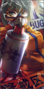
first too big
second looks LQ
third no blending
forth it just looks like u blurred the background with radial blur put a render over it and a text and black and white gradient map and maybe a blue photo filter in the second one
do i need to say anything else except work on it a bit more
try reading some tuts on sigs they really help allot
trust me i know
second looks LQ
third no blending
forth it just looks like u blurred the background with radial blur put a render over it and a text and black and white gradient map and maybe a blue photo filter in the second one
do i need to say anything else except work on it a bit more
try reading some tuts on sigs they really help allot
trust me i know

- Joined
- Feb 27, 2011
- Messages
- 6,482
- Reaction score
- 655
first too big
second looks LQ
third no blending
forth it just looks like u blurred the background with radial blur put a render over it and a text and black and white gradient map and maybe a blue photo filter in the second one
do i need to say anything else except work on it a bit more
try reading some tuts on sigs they really help allot
trust me i know
You forgot cloud effects.

Also another tip is to never save these things as a .jpg, which is why these are so bad quality. Always save them as a .png to ensure the best quality in your graphics, or .gif for animated images.


- Joined
- Mar 17, 2011
- Messages
- 12,892
- Reaction score
- 909
first too big
second looks LQ
third no blending
forth it just looks like u blurred the background with radial blur put a render over it and a text and black and white gradient map and maybe a blue photo filter in the second one
do i need to say anything else except work on it a bit more
try reading some tuts on sigs they really help allot
trust me i know
You forgot cloud effects.
Also another tip is to never save these things as a .jpg, which is why these are so bad quality. Always save them as a .png to ensure the best quality in your graphics, or .gif for animated images.
the text is not clear O_O
I think u got some fair amount of feed back work on these in your next work where u will get some more feedback and u will improve gradually..