- Joined
- Nov 17, 2010
- Messages
- 970
- Reaction score
- 223
Hiyo,!
I Made An epic sig about Itachi,
I have 4 versions, cuz i Really can't choose,
Here They Are, U_U
V1:
V2:
V3:
v4:
Welll...
What do you think of them,
Please let me know,
ThankYoou,~!
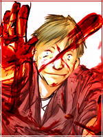
I Made An epic sig about Itachi,
I have 4 versions, cuz i Really can't choose,
Here They Are, U_U
V1:
You must be registered for see images
V2:
You must be registered for see images
V3:
You must be registered for see images
v4:
You must be registered for see images
Welll...
What do you think of them,
Please let me know,
ThankYoou,~!