- Joined
- Mar 13, 2014
- Messages
- 7,669
- Reaction score
- 579
Too much detail, it's looking cringe worthy. Might as well paint him with all the colors smh.

I remember you saying the design worked really well when it first came out./\ this
I thought Boruto's design would look like a mess but turns out it actually doesn't. I like it.
Sarada looks girlier but she gives a bad-ass impression.
I remember you saying the design worked really well when it first came out.
But I guess you're talking about the whole eye being open, and tattoos growing everwhere? I don't really see the whole mess. Considering that he only looks like that at full power.
Reminds me of Curse Seal users. I don't remember seeing anyone complaining about those, but everyone is complaining about everything these days.
oh well
I hate this new manga.
I think they are all going to look bad-ass.lol I'm talking about the fan art OP posted. Boruto's design already has too much going on, it seems like the artist added even more stuff to it.
Anyway, I like Boruto's new design.
Just desaturate OP's pic a little bit and all good.
I think they are all going to look bad-ass.
But I don't think many people will agree with the changes because they don't like Ikemoto's art.
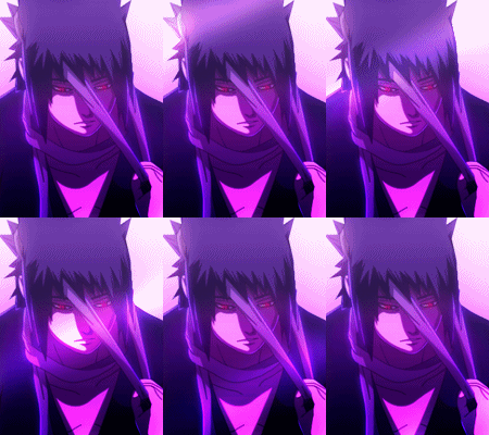

Sarada's look would be 100% better without a skirt.Yeah. IMO, the only design Ikemoto ****ed up real bad is Inojin's design. Other than that, they look all acceptable to me.
People will hate on everything because they can't accept the fact Naruto didn't really end on chapter 699.
In all honest now, I hope Sarada looks as badass as Boruto on the timeskip.
Couldn't agree more bro.
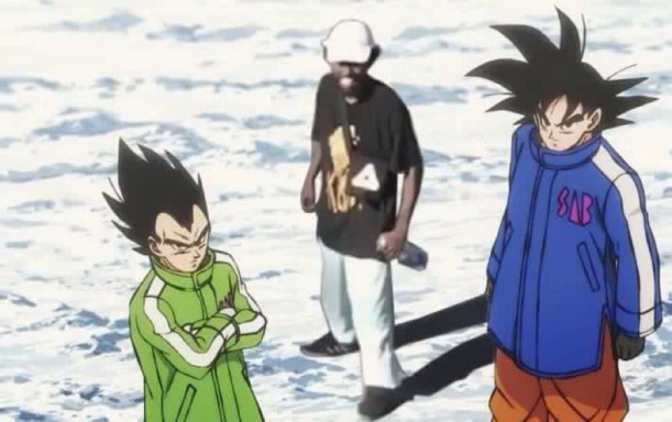
he has as much tattoos as Gray from FT
Gray doesn't have whiskers on his face.
no but he runs around naked all day
Yeah so?
but the dude does have Juvia so he wins in life
His Adult design is awesome.