You are using an out of date browser. It may not display this or other websites correctly.
You should upgrade or use an alternative browser.
You should upgrade or use an alternative browser.
[Photoshop] Dream Prowler
- Thread starter Silico
- Start date
- Status
- Not open for further replies.
More options
Who Replied?

- Joined
- May 26, 2012
- Messages
- 14,626
- Reaction score
- 1,665
Thanks x=ı)
Your sig is not within the allowed dimensions of 600 x 450(Premium). You have to either resize or remove it.
I told you I'd steal it, now don't cry
Your sig is not within the allowed dimensions of 600 x 450(Premium). You have to either resize or remove it.
You must be registered for see links

Zaphkiel
Seraph
- Joined
- Mar 18, 2013
- Messages
- 12,878
- Reaction score
- 487
Thanks x=ı)
Your sig is not within the allowed dimensions of 600 x 450(Premium). You have to either resize or remove it.
You must be registered for see links
Savage.
- Joined
- May 26, 2012
- Messages
- 14,626
- Reaction score
- 1,665
- Joined
- Apr 22, 2014
- Messages
- 24,294
- Reaction score
- 3,330
Nice blue shade.
- Joined
- Dec 22, 2012
- Messages
- 21,037
- Reaction score
- 1,304
Thanks Six!
Don't hate the players, hate the game U_u
So in this case : the player = you(the member) and the game is NB.
Nice going there, making members hate NB.
OT:
Nice tag U_U !
- Joined
- Dec 3, 2012
- Messages
- 39,759
- Reaction score
- 7,032
The title is befitting.

- Joined
- May 26, 2012
- Messages
- 14,626
- Reaction score
- 1,665
I mean.. Hate the dark side of the footSo in this case : the player = you(the member) and the game is NB.
Nice going there, making members hate NB.
OT:
Nice tag U_U !
")
That's because the text is in the tagThe title is befitting.

- Joined
- May 26, 2012
- Messages
- 14,626
- Reaction score
- 1,665
See what you can do when I help. <3
Textwisilitie and yes >_> <3

- Joined
- Mar 27, 2014
- Messages
- 6,442
- Reaction score
- 607
Textwisilitie and yes >_> <3
*invents new word me=
You must be registered for see images
*<3 me=
You must be registered for see images

- Joined
- Sep 25, 2012
- Messages
- 8,298
- Reaction score
- 1,484
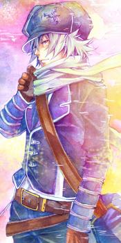
Alrighty! So my CnC as promised.
Firstly , I commend thou for making a tag, finally, after all these years, NB's Design Hall veteran, old manSkormocopolis, is back U_U
The first thing I've noticed on this tag is the amount of sharpness that's going on, its a bit too overpowering, I suspect the use of "Topaz clean" due to the detail on the butterflies (did you render them yourself or were they pngs?) If you rendered them then good job
But to add to the sharpness, the render itself was already sharp in the first place so its kinda hard to get rid of that :3
Now to depth, there's little to no depth in this piece, though I suspect that that's intentional, as it feels like a fractalic/lighted tag in the sense that you chose not to pay attention to the sig rules (which I like, because not all rules need to be followed). Or it could be that you added depth but then when topaz was used, it kinda 'unblurred" the piece, so the depth was killed (that was something you taught me a few years back, remember?)
In this case, with the render already looking like it was topaz'd, you could have used a high pass filter (filters>other>highpass>8.0) and set it to soft light with 13-20% opacity, it would have made the tag HD'ish without giving the plastic feeling on the tag that Topaz gives. I suspect you know this already tho z.z lol
Now on to the text, I don't think there's nothing wrong with it apart from the tiny text, its a bit weird being placed there now that I look at it. Maybe it'd look better without it. But meh its not really noticeable that much. But you always surprise me with text art, i really like the effects you added around the text; that's something I always try doing but end up failing, mostly due to laziness xD. So kudos on the text
The lighting is kinda off around the butterflies and the text to the render area (at the left side) and it needed a kinda main lighting feature around the head area to make it pop a bit.
Anyways, this is a really nice tag and there's not really any noticeable negatives attached to it. KIU! U_U
Firstly , I commend thou for making a tag, finally, after all these years, NB's Design Hall veteran, old manSkormocopolis, is back U_U
The first thing I've noticed on this tag is the amount of sharpness that's going on, its a bit too overpowering, I suspect the use of "Topaz clean" due to the detail on the butterflies (did you render them yourself or were they pngs?) If you rendered them then good job
But to add to the sharpness, the render itself was already sharp in the first place so its kinda hard to get rid of that :3
Now to depth, there's little to no depth in this piece, though I suspect that that's intentional, as it feels like a fractalic/lighted tag in the sense that you chose not to pay attention to the sig rules (which I like, because not all rules need to be followed). Or it could be that you added depth but then when topaz was used, it kinda 'unblurred" the piece, so the depth was killed (that was something you taught me a few years back, remember?
)In this case, with the render already looking like it was topaz'd, you could have used a high pass filter (filters>other>highpass>8.0) and set it to soft light with 13-20% opacity, it would have made the tag HD'ish without giving the plastic feeling on the tag that Topaz gives. I suspect you know this already tho z.z lol
Now on to the text, I don't think there's nothing wrong with it apart from the tiny text, its a bit weird being placed there now that I look at it. Maybe it'd look better without it. But meh its not really noticeable that much. But you always surprise me with text art, i really like the effects you added around the text; that's something I always try doing but end up failing, mostly due to laziness xD. So kudos on the text
The lighting is kinda off around the butterflies and the text to the render area (at the left side) and it needed a kinda main lighting feature around the head area to make it pop a bit.
Anyways, this is a really nice tag and there's not really any noticeable negatives attached to it. KIU! U_U
- Status
- Not open for further replies.