You are using an out of date browser. It may not display this or other websites correctly.
You should upgrade or use an alternative browser.
You should upgrade or use an alternative browser.
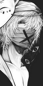
[Photoshop] Gray Fullbuster
- Thread starter Akаsh
- Start date
More options
Who Replied?

- Joined
- May 13, 2014
- Messages
- 15,664
- Reaction score
- 1,229
My first sigs were way more uglier than this Lol Nice Job man.
Tho I would recommend different fonts and more effects.
Tho I would recommend different fonts and more effects.
- Joined
- Oct 24, 2009
- Messages
- 25,039
- Reaction score
- 881
My first sigs were way more uglier than this Lol Nice Job man.
Tho I would recommend different fonts and more effects.
Thank you ^^
I like simple retro fonts, but i will keep in mind to get some badass ones, I just don't know how to integrate them properly with the sigs, I mean.. it takes a lotta for finding the right font


Bluelightning
Member
- Joined
- Dec 29, 2014
- Messages
- 89
- Reaction score
- 5
It looks nice!
- Joined
- Mar 10, 2014
- Messages
- 3,023
- Reaction score
- 233
its cool! :hooray:
I like your sig more though :x3:
I like your sig more though :x3:


- Joined
- Sep 25, 2012
- Messages
- 8,298
- Reaction score
- 1,485
Nice for a first try! ")
You have potential.. my first sig looked 1000000000 times worse than this.
A render of this type should be placed in the middle of the canvas, thus bypassing the rule of thirds logic. Also, when working with these types of renders, dont make the canvas so long, rather, increase the height of it..
Text is everyone's nightmare but you'll get better
Go easy on the brushing for now though
Anyways, my CnC is all over the place (because I'm lazy rn) so check out these tuts:
You must be registered for see links
You must be registered for see links
Last edited:
- Joined
- Oct 24, 2009
- Messages
- 25,039
- Reaction score
- 881
Nice for a first try!
You have potential.. my first sig looked 1000000000 times worse than this.
A render of this type should be placed in the middle of the canvas, thus bypassing the rule of thirds logic. Also, when working with these types of renders, dont make the canvas so long, rather, increase the height of it..
Text is everyone's nightmare but you'll get better
Go easy on the brushing for now though
Anyways, my CnC is all over the place (because I'm lazy rn) so check out these tuts:
You must be registered for see links
You must be registered for see links
Thanks so much ^^
will definitely use this piece of advice
btw, the 2 links don't work.. :NO:
- Joined
- Sep 25, 2012
- Messages
- 8,298
- Reaction score
- 1,485
Thanks so much ^^
will definitely use this piece of advice
btw, the 2 links don't work.. :NO:
I just edited the links! ^^
- Joined
- Oct 24, 2009
- Messages
- 25,039
- Reaction score
- 881
I just edited the links! ^^
OMG
they're amazing!!
i'll see if I caan post one tomorrow ^_^
thanks a bunch, once again!

- Joined
- Feb 17, 2012
- Messages
- 1,897
- Reaction score
- 723
Not too bad, one thing you should work on would be your flow. In this piece its all over the show, you have a lot of straight lines going in different directions. I agree with Horus about the canvas dimensions, higher would have been better than longer, infact this render would have made for a much better vertical tag.
Always look at the render to see where the lighting needs to go. The majority of the lighting in there is on the left edge, when the man light source needs to be above the render and a few lighting effects around and close to the render.
Try to take your time when it comes to blending, this is a process done over the entire making of the tag. Many people make the mistake of throwing a few adjustment layers in their tags, and say yay its blended but its not the case. The adjustment layers simply complete the blending and lift the atmosphere, the rest comes from using the right effects in the right areas as well as having a good balance of lighting and shading,flow,depth and colors. All these things count when it comes to blending.
Last but not least your text, using simple standard fonts is fine. Infact the often work better than fancy fonts, but you need to make them exciting. Using two words and one color isn't very exciting, so try to spice it up a bit. A good font match is ariel and impact, also try to match the size of your text to the size of your tag, it needs to compliment the render not over power it. So add some color to it(not all the same color) add some tiny text brushes, and even some asian text would look good.
Anyway just keep practicing and you will begin to pick it up. Here is a link to what I think is one of the best guides out there, it explains everything in good detail. Its a long read but well worth it, it also has a tutorial at the end of it. I uploaded it to my mediafire account so feel free to download it if you wish.
DOWNLOAD:
You must be registered for see links
- Joined
- Oct 24, 2009
- Messages
- 25,039
- Reaction score
- 881
Not too bad, one thing you should work on would be your flow. In this piece its all over the show, you have a lot of straight lines going in different directions. I agree with Horus about the canvas dimensions, higher would have been better than longer, infact this render would have made for a much better vertical tag.
Always look at the render to see where the lighting needs to go. The majority of the lighting in there is on the left edge, when the man light source needs to be above the render and a few lighting effects around and close to the render.
Try to take your time when it comes to blending, this is a process done over the entire making of the tag. Many people make the mistake of throwing a few adjustment layers in their tags, and say yay its blended but its not the case. The adjustment layers simply complete the blending and lift the atmosphere, the rest comes from using the right effects in the right areas as well as having a good balance of lighting and shading,flow,depth and colors. All these things count when it comes to blending.
Last but not least your text, using simple standard fonts is fine. Infact the often work better than fancy fonts, but you need to make them exciting. Using two words and one color isn't very exciting, so try to spice it up a bit. A good font match is ariel and impact, also try to match the size of your text to the size of your tag, it needs to compliment the render not over power it. So add some color to it(not all the same color) add some tiny text brushes, and even some asian text would look good.
Anyway just keep practicing and you will begin to pick it up. Here is a link to what I think is one of the best guides out there, it explains everything in good detail. Its a long read but well worth it, it also has a tutorial at the end of it. I uploaded it to my mediafire account so feel free to download it if you wish.
DOWNLOAD:You must be registered for see links
OMG Thanks alot for that constructive criticism, Will definitely take your advice!
and thanks for the download too, really helpful!!!
They look really nice!!
And I love your sig, btw
Thanks so much mate ^^

- Joined
- Mar 27, 2014
- Messages
- 6,442
- Reaction score
- 607
Good job for the first time! Just keep practicing and you'll get better. *_*
Horus-sama, BB already said most of the things that should be done a bit better so, yeah, for now just focus on some basic things, like the placement of the focal, flow, blending and light and everything else will be better with time.
All in all, awesome first try and KIU! :bouncy:
Horus-sama, BB already said most of the things that should be done a bit better so, yeah, for now just focus on some basic things, like the placement of the focal, flow, blending and light and everything else will be better with time.
All in all, awesome first try and KIU! :bouncy:
- Joined
- Oct 24, 2009
- Messages
- 25,039
- Reaction score
- 881
Good job for the first time! Just keep practicing and you'll get better. *_*
Horus-sama, BB already said most of the things that should be done a bit better so, yeah, for now just focus on some basic things, like the placement of the focal, flow, blending and light and everything else will be better with time.
All in all, awesome first try and KIU! :bouncy:
Thanks Azuuuu! ^_^