Ok, let's start.
You must be registered for see images
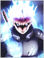
First, the render. I don't like it at all. After practicing GFX some time I noticed that if you are a beginner you even need to choose a render carefully, not in a sense of quality of it or in a sense that a render needs to fit well into a tag but in a sense that render in most cases has some kind of its own lighting (edges especially) as a consequence of being part of original picture which had its own BG. People who are doing GFX-ing more than us have ways to cover that up so that it doesn't look shitty. A beginner needs to work on combination of all elements so that combination of colors doesn't look illogical cause if a beginner tries to cover that it will eventually look ugly as hell.
Now, when you decided to work on a smudge tag you could think of thing I mentioned above and choose colors and flow which would perectly go with your focal.
Second, the size. Small size tag- Big size focal= The space left is not enough to make anything, especially when we are talking about smudge.
Third, the smudge. The more I practice smudge the more I am seeing that smudge is actually, play of contrasting colors and calm, well balanced transition from color to color. Shape is also important, as well, but for a smudge tag shape needs to function well as whole when you are looking on a tag, meaning the flow of a tag must be shape of a smudge. All the rest is play of colors. Well, at least that's how I see it. I would gladly show you the smudge which illustrate what I am talking but since the tag is from different forum I don't think that's appropriate to post here.
Your smudge is none of what I mentioned above. I don't see shape, flow, I don't see contrasting colors, balance of colors to show me the shape. I like the idea you had behind smudge but it's not executed well.
Forth, blending. If you are doing a smudge tag that doesn't mean that you should forget about things you are doing on a regular tag, meaning light, blending, depth. When smudge tag has render as focal point that means that you should blend it using colors from render to connect them with colors from smudge.
Fifth, the text. Someone said that text should not be used for smudge tags and I would disagee with that. Text can look good on any type of a tag if you feel that there are space for text on a tag or when you feel that certain type of text would fit well. However, your text doesn't go well with that tag and to be honest I hate font that line, under it... While I am looking at it I just want to move it somewhere.
Sixth, the idea & the effort. I love idea of the tag and I respect your effort. *_* Good job.
Keep practicing!
You must be registered for see images