You are using an out of date browser. It may not display this or other websites correctly.
You should upgrade or use an alternative browser.
You should upgrade or use an alternative browser.
[Photoshop] Avatars
- Thread starter Αizen
- Start date
More options
Who Replied?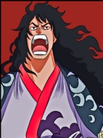
- Joined
- Apr 12, 2012
- Messages
- 27,716
- Reaction score
- 1,797
Not really, you are pretty good at making them from what i'm seeing here aha.......

- Joined
- Mar 22, 2012
- Messages
- 1,348
- Reaction score
- 155
what anime is the last one from?

- Joined
- Feb 7, 2013
- Messages
- 2,277
- Reaction score
- 139
keep trying


- Joined
- Feb 17, 2012
- Messages
- 1,897
- Reaction score
- 723
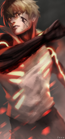
They look nice, simple but nice. I think the Killzone one is a bit empty in terms of lighting and excitement. The second one looks the best to me, the Buu one is ok. But I don't like the way the render is positioned, and the last one is ok too. Maybe add some more lighting to it, but as I said I don't make avatars. So I'm not the best at CnCing them")

thanks :]They're wayyyyy tooo easyy...
But its alright, I guess.
thanks, i'll try to get better.They look nice, simple but nice. I think the Killzone one is a bit empty in terms of lighting and excitement. The second one looks the best to me, the Buu one is ok. But I don't like the way the render is positioned, and the last one is ok too. Maybe add some more lighting to it, but as I said I don't make avatars. So I'm not the best at CnCing them
Third stock used is pretty plain and boring. And, the last stock doesn't seem to be positioned correctly.
okay..