You are using an out of date browser. It may not display this or other websites correctly.
You should upgrade or use an alternative browser.
You should upgrade or use an alternative browser.
3 Avatars
- Thread starter Raiin
- Start date
More options
Who Replied?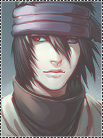
- Joined
- Nov 20, 2012
- Messages
- 797
- Reaction score
- 45
Nice job dude!

Raiin
Member
- Joined
- Dec 29, 2012
- Messages
- 489
- Reaction score
- 67
Nice job dude!
Thanks Man!
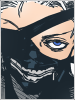
Try using thinner borders and lay low on the opacity of scanlines or rather place them on a new layer while changing the blending option to soft light, other than that they're alright.
Yeah this is my first time using scan lines thanks for the tip!
I like the third one the most because it looks like an off gaurd picture XD
Great job though, your "basic" is pretty good. But then agin, it's basic.
Haha thanks xD
Last edited:
Raiin
Member
- Joined
- Dec 29, 2012
- Messages
- 489
- Reaction score
- 67
They look great")
Thanks! xD


Raiin
Member
- Joined
- Dec 29, 2012
- Messages
- 489
- Reaction score
- 67
Nice keep it up......
Will Do
Liking the second one.
Nice job. *_*
That's my fav one too xD thanks!


- Joined
- Aug 22, 2011
- Messages
- 23,898
- Reaction score
- 1,601
Like none of them.
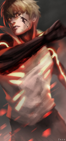
First avatar is boring,light source is too strong nothing's going on there
Second one is nice but quite simple,placement of the image is off...you could place it more to the right so there was some outer space and it wouldn't look so much zoomed as it is.
Finally,third....Bazz's already told you about scan lines,other tip : do not use dark borders on bright avatars.On dark ones - yes ,borders may work but on colorful avys - only light and matching with color borders ,otherwise they can be an eyesore.
If you are not sure about adding a border ,don't add it.Some avatars look much better like that.
Keep trying man,everything else is a matter of time and patience :3
Raiin
Member
- Joined
- Dec 29, 2012
- Messages
- 489
- Reaction score
- 67
Like none of them.
First avatar is boring,light source is too strong nothing's going on there
Second one is nice but quite simple,placement of the image is off...you could place it more to the right so there was some outer space and it wouldn't look so much zoomed as it is.
Finally,third....Bazz's already told you about scan lines,other tip : do not use dark borders on bright avatars.On dark ones - yes ,borders may work but on colorful avys - only light and matching with color borders ,otherwise they can be an eyesore.
If you are not sure about adding a border ,don't add it.Some avatars look much better like that.
Keep trying man,everything else is a matter of time and patience :3
^^Thank You