You are using an out of date browser. It may not display this or other websites correctly.
You should upgrade or use an alternative browser.
You should upgrade or use an alternative browser.
Signatures ._. ._. ._. ._. ._. ._. ._. ._.
- Thread starter -R-
- Start date
More options
Who Replied?
- Joined
- Sep 26, 2012
- Messages
- 12,510
- Reaction score
- 418
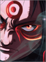
That text in the corner sucked, don't put text in the corner of an image, it'll create another focal and ruin the sig.
Other than that, i like the outcome, it's a nice signature, KIIU.
Other than that, i like the outcome, it's a nice signature, KIIU.

- Joined
- Jun 1, 2013
- Messages
- 1,419
- Reaction score
- 264
They look superb *thumbs up*
Oh reallyzzzz ??? Thank you !
Well, I wanted to write my name on it but didn't find a correct placement.That text in the corner sucked, don't put text in the corner of an image, it'll create another focal and ruin the sig.
Other than that, i like the outcome, it's a nice signature, KIIU.

- Joined
- Mar 15, 2012
- Messages
- 3,726
- Reaction score
- 690
It looks nice, however the right part looks very crowded and messy. And for this sig, I would have used the rule of thirds. If you dont know what that is:
Can you perhaps show me the render which you used? I dont know what it is, but for something about that renders looks very weird.
Edit:
I saw the render which you used in another thread and what you could have done was rotating the render so that it fitted better. Also you could have used the soft eraser tool and erased around the edges of her hair and the weapon she is holding for a little bit of blending. And next time dont use a render with such weird lighting. It makes everything so much more complicated.
Using some gradient maps would make the sig looks less chaotic.
You must be registered for see links
.Can you perhaps show me the render which you used? I dont know what it is, but for something about that renders looks very weird.
Edit:
I saw the render which you used in another thread and what you could have done was rotating the render so that it fitted better. Also you could have used the soft eraser tool and erased around the edges of her hair and the weapon she is holding for a little bit of blending. And next time dont use a render with such weird lighting. It makes everything so much more complicated.
Using some gradient maps would make the sig looks less chaotic.
Last edited:


