
- Joined
- Mar 11, 2013
- Messages
- 14,587
- Reaction score
- 1,222
I dont use the whole, I use the tip of the C4D
Blending
Blending
Blending
Blending
Blending
Blending
Learn it
")
I dont use the whole, I use the tip of the C4D
Blending
Blending
Blending
Blending
Blending
Blending
 The tag is brilliant and the avatars are great.
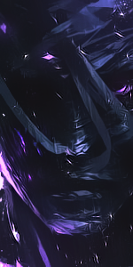
There is no flow. The C4D is to go to the right/left, it must be going up/down
No excitement. The sig is not that flashy ( Pfffffttttt flashy ) add some fractals and what no to add some actions. If you already added some, they are not popping out correctly U_U
The C4D choice was poor. Find some spiked C4Ds they are one of the best C4Ds on the internet.
Nevertheless, keep on trying. Go watch BakaArts tuts on UTube they are really helpful and he has resources to all of his render C4Ds and fracts
The tag is cool, the border looks crap :|
Though its too red :\ also the flow is not correct for some reason, other then that its cool
@Future8Hokage: Spikes C4Ds are the worst ones imo :|
Sweet job
A bit of CnC on the tag:
The topaz is a bit overdone, maybe reduce the opacity on the applied image that you used the topaz filter on.
The text: I don't think the font used is a good choice (Either that or you added a bevel and emboss filter to it), maybe a font like "Haettenschweiler" or "American Captain" would be a better choice.
Anyways, you did a good job. Keep it up
Awesome job dude, are they for the take?
The avatars are. =D

