[Photoshop] Dwarf Sig

Pavoneo

Anbu Operative 🎭
Veteran
Joined
May 1, 2012
Messages
2,646
Reaction score
616
I think the render may be from LoL? Although I'm not sure.

You must be registered for see images


Went for a new style, took like 30 mins this time so odds are it sucks :L.
CnC would be nice.
I didn't really take a break and come back to edit it, so odds are I'm going to be changing some things.

[EDIT]
V2, I don't like it but meh.
You must be registered for see images
 
Last edited:

Horus

Elite
Joined
Sep 25, 2012
Messages
8,298
Reaction score
1,485
Good job there ^^
I don't like the font that you used though Zzz
 

Hei

Supreme
Joined
Aug 22, 2011
Messages
23,898
Reaction score
1,601
1st: i like the idea with fractals but you messed up here,some dots should be erased because thay are out of the flaw
2nd: the background and the render contrasts too much in quality,especially top right corner
3rd: the text is too far from the main focal,moving it closer to the render would be nice

Good attempt,i like it but there is no much in that signature to be honest^^
 

Pavoneo

Anbu Operative 🎭
Veteran
Joined
May 1, 2012
Messages
2,646
Reaction score
616
Good job there ^^
I don't like the font that you used though Zzz
D: why not?
1st: i like the idea with fractals but you messed up here,some dots should be erased because thay are out of the flaw
2nd: the background and the render contrasts too much in quality,especially top right corner
3rd: the text is too far from the main focal,moving it closer to the render would be nice

Good attempt,i like it but there is no much in that signature to be honest^^

Yeah, since it's my first time doing a sig without smudging or using C4Ds, I expected it to suck and not have much :s. I agree with you on all your points tbh, this isn't one of my better sigs .-. I guess I'll keep trying and hopefully get better. Thanks for the CnC mate.
 

Genjin

Anbu Operative 🎭
Veteran
Joined
Aug 10, 2011
Messages
2,529
Reaction score
320
I believe that is from DoTa. Nothing else to explain here since you did a good job except for the text and the random writings below it. Just do what Mizuchi said and also lighten the left side a bit. Cheers!
 

-S-

Legendary Shinobi 🐸
Immortal
Joined
Jan 16, 2011
Messages
41,396
Reaction score
2,409
This tag would look so much classier and better without those boring, heavy, clichéd borders. Gosh, I wish GFXers would stop using them now.

Also, sticking to the rule-of-thirds really does help. You were almost there, just the render and text needs to be shifted a bit more to the left.

So yeah, it's a really crisp and nice design and I'd use it to promote whatever game the render is from. But in terms of complexity, it's pretty basic.
 

suki

Anbu Operative 🎭
Veteran
Joined
Feb 9, 2013
Messages
4,357
Reaction score
807
I know I'm not good enough to be on the same level as both you and -S- yet, but I have to agree with that above^
Though, I like it. The render and colorscheme were great quality choices, and the flow and depth aswell as the blending is great. Well done pava :p
 

TheLastSamurai

Anbu Operative 🎭
Veteran
Joined
Dec 29, 2011
Messages
4,521
Reaction score
295
1. the dots in the left top corner above the barrel were unnecessairy
2. that font :O

everall i would say awesome work bro!
 

Genjin

Anbu Operative 🎭
Veteran
Joined
Aug 10, 2011
Messages
2,529
Reaction score
320
The rule of thirds is a major major thing when making certain tags. The focal points is where people look at first.
Damn, I forgot about that.
You must be registered for see images
 

Cascade

Jōnin Strategist 🧠
Regular
Joined
May 10, 2012
Messages
1,469
Reaction score
327
Everything said pretty much

a little 'over-fractalised' (good one right...?)
render placement needs a really small movement,
text needs to be closer to focal
darkness on the left could have been lighter and filled in with something else

however!
i really really really like this tag.
I think the style of the bg and the render work really well together and you've done the lighting rather well, just needs something extra
also colours are really nice XD and depth is fantastic!

Keep goin pav <3
 

-Carnage-

Sannin of the Scrolls 📜
Elite
Joined
Jul 4, 2012
Messages
8,222
Reaction score
661
I LIKE IT! :0 Makes me almost wanna try gfx again... >_>
i like the amount of fractals...seems like i'm the only one though :shy:
I think you should move the text layer below the lighting, gradient, and/or fractal layers, just to blend it in a little more.
uhhhhhhhhh that's about all i got :p

edit: meant layer, not later xd, i corrected it
 
Last edited:

Pavoneo

Anbu Operative 🎭
Veteran
Joined
May 1, 2012
Messages
2,646
Reaction score
616
Welp, lots of CnC on the same stuff. I'm going to remake this sig later/tomorrow so I'll update then. Here's some of my reasonings as to why I did what I did, or rather, excuses xD.

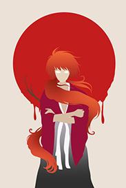
the fractal on the upper left was the one I placed first to try to bring out the flame on top of the barrel a bit more, but then I realized it made the rest of the tag empty, so I added more and more until I guess I overdid it a bit x.x I'll rework my fractals, although I'm not sure how much I'm going to get rid of because if I took 1-2 away, it'd look really empty and just not good.
The text was just me being bad at text as per usual, I tried to implement the rule of thirds into the text a bit (eyeing it rather than actually using a grid, so it's probably off) so that's my reasoning for putting it there. Plus, the hammer he's holding looks really out of place with the BG so I used text to cover it up.
The render placement, well. On all of my tags, like, ever. I was told that I'm putting my render too far off to the sides constantly, and that I should move it more into the middle. I tried doing that this tag, but I suppose I overdid it? .-. I don't know, it's annoying. I do understand how rule of thirds works Genjin, but thanks for reinforcing it xD.

[EDIT]
Took all of your advice and got this.

You must be registered for see images


The left side feels really empty, and the entire tag feels really empty as well, which is why I put so many fractals T_T. I couldn't find anything to put on the left side that would make it look nice, everything looked really out of place and ugly if I put it there, so I just left it empty.
 
Last edited:

Beastbomb

Jōnin Strategist 🧠
Regular
Joined
Feb 17, 2012
Messages
1,897
Reaction score
723
There is a shit load of renders that don't go well with following the rule of thirds as well, but we have been over this before....As for the tag itself I like the second version better, the text can still use a bit more work. It needs something else around it, I couldn't help you with that though since I suck at text myself. The atmosphere and depth is pretty good though nice job overall mate:)
 

Sikk

Leaf Village Regular 🍃
Regular
Joined
Jun 23, 2011
Messages
715
Reaction score
203
I agree with Carnage. I like the fractal amount on first one, maybe just remove the ones in the water. The only thing I like on the second one is the text. Oh and I like those type of borders imo. Overall it's a nice tag to look at. One of my favorites from you =D
 

Deviation

Kage in the Making 👑
Legendary
Joined
May 15, 2013
Messages
14,281
Reaction score
588
If only Skorm and the other GFXers could come to this thread this would be epic. :(

I really like it though the second one is better but I like the text from the first one. I suck at text too so good luck with that. >.>

Nice work Pavo. ^__^
 
Top