[Gimp] Two Smudges

Pavoneo

Anbu Operative 🎭
Veteran
Joined
May 1, 2012
Messages
2,646
Reaction score
616
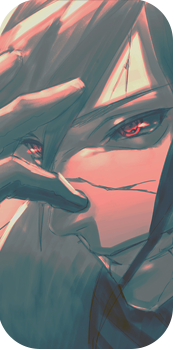
First one is like, 5x better than the second. I used the same style because I love this style of smudging, it's so grungy o_o.

You must be registered for see images


You must be registered for see images


CnC would be nice, although I messed up with a lot so it'd be pretty long :|.

Renders
You must be registered for see images

You must be registered for see images
 
Last edited:

CurseSealofEarth

Sannin of the Scrolls 📜
Elite
Joined
May 16, 2012
Messages
5,311
Reaction score
644
You're right about the first one being better, but only because it looks like he's like ghosting into the picture.
 

BazzBee

Kage in the Making 👑
Legendary
Joined
Mar 11, 2013
Messages
14,587
Reaction score
1,222
I love the second render but i love the 1st smudge :|
 

Ōkami

Legendary Shinobi 🐸
Supreme
Joined
Sep 11, 2012
Messages
21,781
Reaction score
2,396
Looks like the top one is from Diablo three.
 

Delta

Banned
Legendary
Joined
Jul 4, 2012
Messages
12,187
Reaction score
519
yeah the first one looks like its flowing, the second one looks like it has no motion, but they're both pretty awesome
 

Pavoneo

Anbu Operative 🎭
Veteran
Joined
May 1, 2012
Messages
2,646
Reaction score
616
yeah the first one looks like its flowing, the second one looks like it has no motion, but they're both pretty awesome

Thanks for the input mate.
 

Beastbomb

Jōnin Strategist 🧠
Regular
Joined
Feb 17, 2012
Messages
1,897
Reaction score
723
Renders do look awesome:p

The first smudge has a really nice flow to it and the blending is well done. I think that render would look better if it was shuffled left a tad more and also if the edges were darkened a bit, and some dodge/burn in the center the depth would be enhanced much more. Overall though its a very nice piece well done:)

The second isn't as well blended as the first one, the render needs some glow on the left to match the intense lighting in the top left corner. Whilst it does have flow if you compare it to the flow of the first one its no way near as good, it could also use some depth. All in all great work on these, I know how hard smudging is to get right lol KIU:)

Sorry forgot to say the reason I mentioned the render placement is because even though the blending and smudging and what have you is good. There is a lot of empty space on one side of both tags which can bring about a boring look if you get what I mean.
 
Last edited:

Pavoneo

Anbu Operative 🎭
Veteran
Joined
May 1, 2012
Messages
2,646
Reaction score
616
Renders do look awesome:p

The first smudge has a really nice flow to it and the blending is well done. I think that render would look better if it was shuffled left a tad more and also if the edges were darkened a bit, and some dodge/burn in the center the depth would be enhanced much more. Overall though its a very nice piece well done:)

The second isn't as well blended as the first one, the render needs some glow on the left to match the intense lighting in the top left corner. Whilst it does have flow if you compare it to the flow of the first one its no way near as good, it could also use some depth. All in all great work on these, I know how hard smudging is to get right lol KIU:)

Sorry forgot to say the reason I mentioned the render placement is because even though the blending and smudging and what have you is good. There is a lot of empty space on one side of both tags which can bring about a boring look if you get what I mean.

Thanks for your input as per usual. :3. I usually place my renders on the side of the tag because I hate when tags have their render in the middle, because then instead of making one large complex background on one side of the render, you make two less complex backgrounds on both sides of it. Any other suggestions for filling that empty space on the sides instead? I'd rather preserve the flow so I avoid doing anything artsy, I'm not sure if adding a fractal or c4d would completely suffice the empty space so I'm a bit confused as to what to do >.<
 

Beastbomb

Jōnin Strategist 🧠
Regular
Joined
Feb 17, 2012
Messages
1,897
Reaction score
723
You don't need to place the render directly in the center, but if you move them just a bit lets say roughly between where you have them now and the center you will still maintain your flow. But at the same time reduce the amount of empty space on one side, you would be suprised the amount of diffrence it makes just by shifting them a few pixels. The other thing is use text to fill the empty space, also like I said if you take a soft brush and using black just paint around the edges a bit and play with the opacity. Not only will it add depth but it will also make the empty area appear smaller these are just a few ideas off the top of my head:)
 

Pavoneo

Anbu Operative 🎭
Veteran
Joined
May 1, 2012
Messages
2,646
Reaction score
616
You don't need to place the render directly in the center, but if you move them just a bit lets say roughly between where you have them now and the center you will still maintain your flow. But at the same time reduce the amount of empty space on one side, you would be suprised the amount of diffrence it makes just by shifting them a few pixels. The other thing is use text to fill the empty space, also like I said if you take a soft brush and using black just paint around the edges a bit and play with the opacity. Not only will it add depth but it will also make the empty area appear smaller these are just a few ideas off the top of my head:)

Thanks for the help as always :3. You're right.
 

Drāgy

Member
Joined
Apr 22, 2013
Messages
6,458
Reaction score
187
I love the first one, nicely done sir. Keep up the good work! :yeah:
 

Cascade

Jōnin Strategist 🧠
Regular
Joined
May 10, 2012
Messages
1,469
Reaction score
327
So firstly, your current signature is amazeballs. GC FTW.
Second, i really lik the first one, the effect is cool with that much smudge and it works horizontally, its like he's peering out through the wind, but i dont like the second one as much as it seems less fluid cause the theme or flow isnt the same, also seems a little LQ on the left? Maybe some more stuff coulda been added, but nice shiek, smooth has always been ur style.

Nice Pavoneo
 

suki

Anbu Operative 🎭
Veteran
Joined
Feb 9, 2013
Messages
4,357
Reaction score
807
Pretty good, very interesting.. I really like the first one more then the second one as-well, but as a designer, I'd say that the second one is better, because the features and aspects really blend in with the smudge effect excellently well ^^

Keep it up!
 

-Carnage-

Sannin of the Scrolls 📜
Elite
Joined
Jul 4, 2012
Messages
8,222
Reaction score
661
Sweetness :cool:
The first one is awesome <3
 

Penguin

Legendary Shinobi 🐸
Supreme
Joined
Feb 15, 2013
Messages
29,918
Reaction score
1,503
Not. Bad. At. All.
 

Pavoneo

Anbu Operative 🎭
Veteran
Joined
May 1, 2012
Messages
2,646
Reaction score
616
Old thread :T_T:
So firstly, your current signature is amazeballs. GC FTW.
Second, i really lik the first one, the effect is cool with that much smudge and it works horizontally, its like he's peering out through the wind, but i dont like the second one as much as it seems less fluid cause the theme or flow isnt the same, also seems a little LQ on the left? Maybe some more stuff coulda been added, but nice shiek, smooth has always been ur style.

Nice Pavoneo
Thanks mate, and I completely see where you're coming from on my second sig.

Pretty good, very interesting.. I really like the first one more then the second one as-well, but as a designer, I'd say that the second one is better, because the features and aspects really blend in with the smudge effect excellently well ^^
Haha,

Keep it up!
thank you^^.
Sweetness :cool:
The first one is awesome <3
Thanks :3.
Not. Bad. At. All.
Thank you.
Really Cool:win:
Thanks. :)
 
Top