You are using an out of date browser. It may not display this or other websites correctly.
You should upgrade or use an alternative browser.
You should upgrade or use an alternative browser.
[Photoshop] Dream Sig
- Thread starter Melodious
- Start date
More options
Who Replied?
- Joined
- Mar 24, 2013
- Messages
- 6,017
- Reaction score
- 392
Noice noice ")
- Joined
- Feb 11, 2012
- Messages
- 6,612
- Reaction score
- 900
Noice noice
That's nice.
Thanks! ;D
Text is sweet. Colours are great too.
I think this kind of tag would be better off without borders, try it and see if you agree.
Thanks! ;D
You must be registered for see links
Last edited:


- Joined
- Feb 11, 2012
- Messages
- 6,612
- Reaction score
- 900
The render needs more blending and the signature lacks of flaw but overall it's nice..
I agree, thanks for your feedback! ;D

- Joined
- Apr 21, 2012
- Messages
- 16,406
- Reaction score
- 742
Very nice 

- Joined
- Jan 16, 2011
- Messages
- 41,396
- Reaction score
- 2,409
Thanks! ;DYou must be registered for see links
Told you
Same thing I told Mercy a while back, I think tags like this look crisper without the border.
Last edited:
- Joined
- Feb 11, 2012
- Messages
- 6,612
- Reaction score
- 900
Very nice
Thanks! ;D
Told you
Same thing I told Mercy a while back, I think tags like this look crisper without the border.
Putting a border is a habit. xD Never actually took a good look at it without the border. Going to try it with my future sigs! ^^

- Joined
- May 1, 2012
- Messages
- 2,646
- Reaction score
- 616
This is really good, but something's off but I can't really put my finger on it >.< I think the main problem is that the colours don't really compliment the render all too well. Like, if that dark green was maybe the colour of her hair it would be better. Or maybe adding a stronger light source above her head. This was blended beautifully, and the text is amazing (so jealous you could do text well :|)
- Joined
- Feb 11, 2012
- Messages
- 6,612
- Reaction score
- 900
This is really good, but something's off but I can't really put my finger on it >.< I think the main problem is that the colours don't really compliment the render all too well. Like, if that dark green was maybe the colour of her hair it would be better. Or maybe adding a stronger light source above her head. This was blended beautifully, and the text is amazing (so jealous you could do text well :|)
I bet it had to do something with the render. xD Ah, I see, thanks so much for the feedback! ;D Haha, I'm actually surprised myself that I did good on the text. ;p I usually suck at text..

- Joined
- Mar 30, 2011
- Messages
- 6,190
- Reaction score
- 1,102
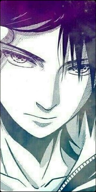
Just an experiment. ;p
You must be registered for see images
Resources:
You must be registered for see images
Scoreee, I remembered the prefix!
Its nice, lighting is ok, not too bright, and not too dull, although I can't see where the light is coming from. Depth is good too, although I think dodging/burning some parts would improve it. The colors...well I think someone already commented on that, so I'll go to the flow, I'd just say its not perfect, maybe if you improve the c4d placement it'd be all right. I think the text placement is good, but the first thing I set my eyes on after clicking this thread was "It's all a..." what I'm trying to say is, the text takes away the viewers attention, somewhat creating a double focus, the second string of text is hardly seen too>_>, and that's not the best choice of font, but I see a success ahead of your experiment, and I'm not saying this is a failure, its actually good, keep it up and you'd be happy with the result at the end=D
- Joined
- May 26, 2012
- Messages
- 14,626
- Reaction score
- 1,665
Though shall receive a CnC from me >_O.
Alright let's begin.
First of all i'd like to say that the tag looks good, but i find some flaws here and there that i'll point out later in this CnC.
You've created a flow with all the C4D's but it gets kinda confusing and feels like it doesn't lead somewhereZzz.
There is a clear focal(GOOD!) and that's a mistake many does in their signatures, or have one too many
. The colors are OK, but could've blended more i think, this would be solved with gradient maps and further lightning blending.
The text is actually very good and you've created a 3D feeling to it(wonder if it will stick out from the screen if i use 3D classes XD). I feel as if the three "dots" could've been placed under the "Dream" text as well, or maybe experiment with it more. The "Dream" part is slightly hard to read, but after looking on it a while you can see what it says though
. Hm. I think the text also could do a little better if you moved it closer to the renders center. The "It's all" part of the text is too far away from the focal(renders center) i think. It makes you look away from the renders face, which i don't think it needs to do . Alright so now i'm going to point out some stuff here.
You must be registered for see images
Let's begin with 1.
1. The lightning on her hair is slightly too bright and almost creates a focal itself. I also think it looks very "blurred-out" on the edges, but i guess that's how you've blended the render with the C4D's anyway since i see that on other places too. The green C4D on the left of her hair isn't blended well and you can see the edge of it, i'd place the C4D there behind the render maybe..
2. Sup with the dull lights
? I notice them at various spots and it feels like you wanted to create something more.. Shiny.. with that light, or am i totally wrong? If i'm right then i'd recommend you to duplicate the lightning layer and put the duplicate on "Linnear Dodge" mode. If i'm wrong well then i say it doesn't look that good if it was how you intended originally >_O.3. That part confuses me depth-wise. There are stuff behind that part that is sharper, which makes no sense O__O. If you wanted to create a motion blur, i suggest you make that more obvious cause now it feels like you just used the blur tool.. Or marked the area and put it on gaussian blur.
4. I see you put some fractals over the render there. It's fine, but the fractal looks low-quality and there should be various of fractals along the whole tag to make it look more dynamic i think.. Different fractals ofc. Now it looks like you just dumped the fractals on one place on the tag to make it blend more, but let me tell you that you can use it at more places than just one in the tag
. 5. Pretty much the same as 4.
6. That is a good spot with lightning. That's how i feel all the soft brush lightning spots should've been. There is another depth problem though and it's the white part from the background feels closer than the C4D's above it Zzz.
7. Needs another lightning dot imo. That place is just dull and lifeless:dunno:. Also i'd blur it out slightly more to add depth in the overall tag. The tag needs more dynamic depth, instead of confusing one
.8. The lightning is too dull. Make it brigher, and if it gets too bright just blur the area. Although i recommend you to adjust the lightning perfectly instead of having to blur the area like hell O_O.
9. Again, very dull light. The soft light brush(i guess) doesn't make it look good there. Makes the lightning more un-dynamic and dull.
I believe that's it for the spots. Now i want to add three things that i forgot to point out >_<..
The red C4D on the far right isn't looking good. It makes the color too dominant on the side and thus takes too much attention.
The other thing i'd like to point out is the fact that you seriously would've got a better result if you'd use a vignette(darken the borders). Would make more dynamic lightning and more focus on the actual focal.
Last thing is that i think you could've used more effects, gradients, contrast etc.
So overall work in this:
*Blending, well there are some parts that are ok blended but.. Others that are just not good at all. Lightning is a big part in blendning and you need to work to get those techniques together i think.
*Lightning spots. There are two good one's(at point 6 and 8) but the rest are very dull. You need to make all lightning dots equally bright or atleast more equally.
*Depth. There are some spots on the tag where the depth is a big question mark. I suggest you get used to other blur options like box/motion blur.
*Effects. I feel as if you need to make more effects and learn to use the dodge/burn tool to make lightning blend better. Also, VIGNETTE! I highly recommend it when the focal is in the center of the tag
That's it for me, goodluck developing >_O.
- Joined
- Feb 11, 2012
- Messages
- 6,612
- Reaction score
- 900
Its nice, lighting is ok, not too bright, and not too dull, although I can't see where the light is coming from. Depth is good too, although I think dodging/burning some parts would improve it. The colors...well I think someone already commented on that, so I'll go to the flow, I'd just say its not perfect, maybe if you improve the c4d placement it'd be all right. I think the text placement is good, but the first thing I set my eyes on after clicking this thread was "It's all a..." what I'm trying to say is, the text takes away the viewers attention, somewhat creating a double focus, the second string of text is hardly seen too>_>, and that's not the best choice of font, but I see a success ahead of your experiment, and I'm not saying this is a failure, its actually good, keep it up and you'd be happy with the result at the end=D
Though shall receive a CnC from me >_O.
Damn, thanks so much you guys! ;D I really appreciate you taking time to CnC my work. ^^
From my "doesn't know anything" perspective, it's actually pretty cool, lol.
Haha, thanks! ;D