The Aviator
Member
- Joined
- May 30, 2013
- Messages
- 207
- Reaction score
- 33
CnC appreciated as always ")
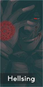
Signature:
Render used:
Signature:
You must be registered for see images
Render used:
You must be registered for see images
P.S.:
Tried making BG by the way of random smudging... ended up making a Batman-like logo
Pretty convenient, if I do say so myself.
Tried making BG by the way of random smudging... ended up making a Batman-like logo
Pretty convenient, if I do say so myself.