- Joined
- May 19, 2013
- Messages
- 1,067
- Reaction score
- 93
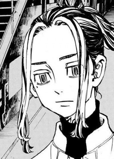
Did a little sketch of Itachi ") CnC appreciated :3
CnC appreciated :3
CnC appreciated :3
You must be registered for see images
CnC appreciated :3

Look good to me but add more shading to give it more dimensional feeling


Thanks =DI like it. Better than I could.
Thanks, I'll try to fix thatnice work xd
but his face looks a little chubby
Thank you =D And nice picture xDNice work =D
ThanksMe likey <3

good job and like Kato said, shading it will make it even better. thanks for sharing.

I'm not hurt at all, thanks for all the input, I'll try to fix the things you pointed out =DGood work. Here is some things I would like you to fix/add though, I hope they don't hurt your feelings.. It's for your own good *_*
- the right eye is a little low, and angled wrongly, try tilting it over a little to suit the left and move it up a little
- the ear looks weird since I believe it's placed wrongly, try moving it down a little and give it a little more detail, also show the year more *_*
- last of all, I believe It is overall a great piece, I think you should start with shading and tone like Uzumaki Kato said
good job and like Kato said, shading it will make it even better. thanks for sharing.
Exactly what he said. I like it, but wanna see more done with it.
Really nice, needs more work though in terms of shading and variation of tone