You are using an out of date browser. It may not display this or other websites correctly.
You should upgrade or use an alternative browser.
You should upgrade or use an alternative browser.
[Photoshop] A couple of new sigs
- Thread starter Beastbomb
- Start date
More options
Who Replied?
- Joined
- Dec 13, 2012
- Messages
- 781
- Reaction score
- 41
looking good


- Joined
- Jun 21, 2012
- Messages
- 1,726
- Reaction score
- 90
the lelouch sig looks nice


xCrystalChidorix
Member
- Joined
- Jan 21, 2013
- Messages
- 136
- Reaction score
- 26
Very cool. Nice work. 
How long ya been makin' 'em?
How long ya been makin' 'em?
- Joined
- May 17, 2012
- Messages
- 3,432
- Reaction score
- 503
Pretty dope!


- Joined
- Apr 24, 2012
- Messages
- 14,472
- Reaction score
- 572
Amazing work, but the Lelouch one needs to look less bright...

- Joined
- Dec 3, 2012
- Messages
- 39,759
- Reaction score
- 7,032
Excellent work, esp. the first one

- Joined
- Feb 17, 2012
- Messages
- 1,897
- Reaction score
- 723
beast! I like the first one.. light and shit
Cheers Grim, I'm a happy man when I get a good response from you
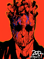
I spent a fair amount of time on the lighting in that first one. Probably more than any other tag I have ever made, just shows if you take your time and try things you will get a better result. Its not perfect, but I was happy with what I got it, was for the final round in a staff vs members tournament. Too which I got 3rd(out of 4) although whilst I didn't think I should have won, the tag that did win I feel was the worst out of the 4. But smudge(what can you do lol)The Lelouch tag, I was happy with for the simple fact that I am terrible when it comes to using anime renders lol. I don't know why, but 8.5 times out of ten its a bad finish(text is terrible too)
The last one I thought was very messy, and lighting is shoddy at best, funny enough though its currently winning the VOTW(verticle of the week) by 2 votes. I love the text I did i this one, but really it shouldn't beat a dead donkey


- Joined
- Feb 17, 2012
- Messages
- 1,897
- Reaction score
- 723
Last one looks best imo. Love the flow and the colour. First one is great as well, I love the depth in it. Second one is nice but It isnt one of your 'wow' sigs :/
Nice work Beast^^
Thank you Sam
I hate using anime renders they just never seem to work for me lol. But it was a gift and this is his fav character so I had to go with animefirst one i love
second one i dislike
third one is ok
xd
im ill and really have no time to cnc sorry about this
overall you are great
Thanks JustL and all good man, you summed it up with few words