You are using an out of date browser. It may not display this or other websites correctly.
You should upgrade or use an alternative browser.
You should upgrade or use an alternative browser.
Naruto Signature
- Thread starter Salad
- Start date
More options
Who Replied?
- Joined
- Apr 18, 2012
- Messages
- 8,783
- Reaction score
- 935
Another awesome work!


- Joined
- Dec 12, 2012
- Messages
- 5,810
- Reaction score
- 459
ThanksYou are a really good GFXer.
")
Thanks mateGewd wurk ^.^

- Joined
- Dec 12, 2012
- Messages
- 5,810
- Reaction score
- 459
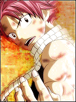
Render and background don't match
I thought it did :ghehe: Thanks for the input though.


- Joined
- Feb 17, 2012
- Messages
- 1,897
- Reaction score
- 723
Not to bad mate, although to me it feels empty I think adding some foreground effects would make it much more interesting and would add a lot more depth. The background is ok, but I feel the color doesn't go with the render, it also needs a lighsource on the right side above his arm. Other than that you have done a nice job, so find some tuts and keep practicing
- Joined
- Oct 8, 2012
- Messages
- 5,566
- Reaction score
- 254
Okay hihi ^_^
First off, I feel the layer still stands out too much, you should put C4D's, vectors, wireframes, etc, etc, over the render to blend it in. (Burn, Blur, Sharpen Tool can do that too)
Second thing is I don't really think the background goes with render, but that's my opinion!
Third off is the flow should be coming from the right down to the left but there isn't anything to make it look like it's flowing D:
Fourth is that you should use soft brushes on overlay&lighten to make things more realistic, for example Naruto's arm on the right should have some light too it
Overall though, it looks alright You're improving every sig you make I hope you don't take this in a bad way, just some CnC
First off, I feel the layer still stands out too much, you should put C4D's, vectors, wireframes, etc, etc, over the render to blend it in. (Burn, Blur, Sharpen Tool can do that too
)Second thing is I don't really think the background goes with render, but that's my opinion!
Third off is the flow should be coming from the right down to the left but there isn't anything to make it look like it's flowing D:
Fourth is that you should use soft brushes on overlay&lighten to make things more realistic, for example Naruto's arm on the right should have some light too it
Overall though, it looks alright
You're improving every sig you make I hope you don't take this in a bad way, just some CnC
- Joined
- Dec 12, 2012
- Messages
- 5,810
- Reaction score
- 459
Thanks for the CnC :y I will try resolving it next timeOkay hihi ^_^
First off, I feel the layer still stands out too much, you should put C4D's, vectors, wireframes, etc, etc, over the render to blend it in. (Burn, Blur, Sharpen Tool can do that too
Second thing is I don't really think the background goes with render, but that's my opinion!
Third off is the flow should be coming from the right down to the left but there isn't anything to make it look like it's flowing D:
Fourth is that you should use soft brushes on overlay&lighten to make things more realistic, for example Naruto's arm on the right should have some light too it
Overall though, it looks alright